Lighting and Colour: How the Right Light Transforms the Look of Your Décor
Ever noticed how colours look different at night? The secret’s in the lighting. Learn how to match light and colour for balanced, beautiful home design.
Have you ever painted a wall the perfect shade of grey, only to find it looks completely different at night? Or bought a lamp that seemed warm in the shop but feels harsh at home? That’s the magic—and the frustration—of lighting and colour.
Light has the power to completely change how we see colour, texture, and atmosphere. The same paint, sofa, or rug can shift in tone depending on the bulb you use or the direction of sunlight. The good news? Once you understand how lighting and colour work together, you can use it to your advantage—making your home feel brighter, warmer, and more balanced without a major redesign.
Let’s explore how the right lighting design can transform your décor.
Why Lighting Changes the Way We See Colour
Lighting affects how we perceive colour because light contains colour itself. Every light source—natural or artificial—has a colour temperature, measured in Kelvins (K).
- Warm light (2700K–3000K): Adds cosy golden tones, perfect for relaxing spaces.
- Neutral light (3500K–4000K): Balanced, ideal for kitchens and work areas.
- Cool light (5000K+): Crisp and bright, often used in offices or daylight settings.
Warm lighting brings out reds, oranges, and yellows, while cool lighting enhances blues and greys. The key is choosing the tone that suits your colours and the mood you want to create.

Natural vs Artificial Light
Natural daylight changes throughout the day:
- Morning light is cool and crisp.
- Afternoon light is warm and golden.
- Evening light fades to soft, muted tones.
That’s why your wall colour may look completely different at 8am versus 6pm.
Artificial light helps you control consistency. The trick is choosing bulbs that complement your décor and mimic the mood you want all day long.
Lighting for Different Colour Palettes
1. Whites and Neutrals
Whites and neutrals are the trickiest because they reflect surrounding colours easily. Under warm lighting, white walls can appear creamy or yellow; under cool lighting, they might feel stark or blue.
Tip: Use neutral or warm-white bulbs (around 3000K) to keep whites soft and inviting.
2. Bold Colours
Deep blues, greens, and terracottas thrive under warm light. It adds depth and makes colours feel richer.
Tip: Use accent lighting—like wall sconces or picture lights—to bring out the vibrancy of darker shades.
3. Soft Pastels
Pastels can fade under strong cool lighting. Warm, diffused light helps them stay gentle and balanced.
Tip: Choose lampshades that soften glare and distribute light evenly.
4. Metallics and Textures
Metallics (gold, brass, chrome) reflect light beautifully, while matte finishes absorb it. Playing with both adds visual interest.
Tip: Try layering warm accent lights to make metallic finishes glow.
Room-by-Room Colour + Lighting Pairings
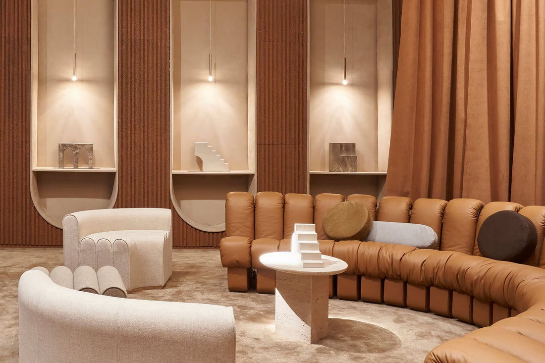
Living Room
Use warm white lighting (around 2700K–3000K) to make neutral or earthy tones feel inviting. Mix ambient ceiling lighting with table lamps and wall lights for layers.
Bedroom
Soft, dimmable lighting enhances muted colours and promotes relaxation. Try warm bedside lighting with cool accent lights for reading.
Kitchen
Bright, neutral lighting (3500K–4000K) keeps colours true and makes prep areas practical. Under-cabinet LEDs prevent shadows and add depth.
Bathroom
Opt for clear, natural light near mirrors for accurate colour reflection. Use warm accent lighting to soften the overall space.
Home Office
Cooler white lighting helps focus and keeps wall colours looking sharp. Add a desk lamp for adjustable task lighting.

How to Test Lighting with Colour
Before committing to paint or fittings, test how lighting affects your colours:
- Try paint samples under natural and artificial light.
- Use a mix of warm and cool LED bulbs to see which works best.
- Place a lamp in different corners to test how the direction changes the look.
Pro Tip: Smart bulbs let you adjust tone and brightness, perfect for experimenting with lighting moods.
Budget-Friendly Lighting Design Tips
You don’t need to overhaul your lighting plan to get better colour balance:
- Swap out bulbs – Choose adjustable or warm-white LEDs for instant change.
- Add dimmers – Control intensity and mood easily.
- Use plug-in lights – Avoid expensive rewiring while adding flexibility.
- Try LED strips – Affordable, versatile, and perfect for accent lighting.
- Shop smart – Look for lighting deals or best value lighting options for big impact on a budget.
At Light Monster, we believe great lighting shouldn’t cost a fortune. Our curated range of affordable lighting makes it easy to achieve designer-level colour and mood in every room.
Common Lighting & Colour Mistakes
- Mixing too many colour temperatures – It creates visual imbalance.
- Over-lighting small spaces – Harsh light flattens colour and depth.
- Ignoring daylight direction – South-facing rooms look warmer; north-facing need extra warmth.
- Choosing décor in shop lighting – Always test colours at home.
Final Thoughts: Light Brings Colour to Life
Lighting isn’t just about brightness—it’s about harmony. The right light enhances your colour palette, mood, and atmosphere, making your home feel effortlessly balanced. Whether you’re working with deep tones or calm neutrals, understanding how light interacts with colour is the secret to a space that truly shines.
At Light Monster, we make it easy to find value for money lighting that enhances your décor. From adjustable LEDs to warm wall sconces, our collection helps you design with confidence—because great lighting design shouldn’t be complicated or costly.


